Rebranding of Bad Dinosaur, an agency that builds software
I was tasked with coming up with a new look for Bad Dinosaur.
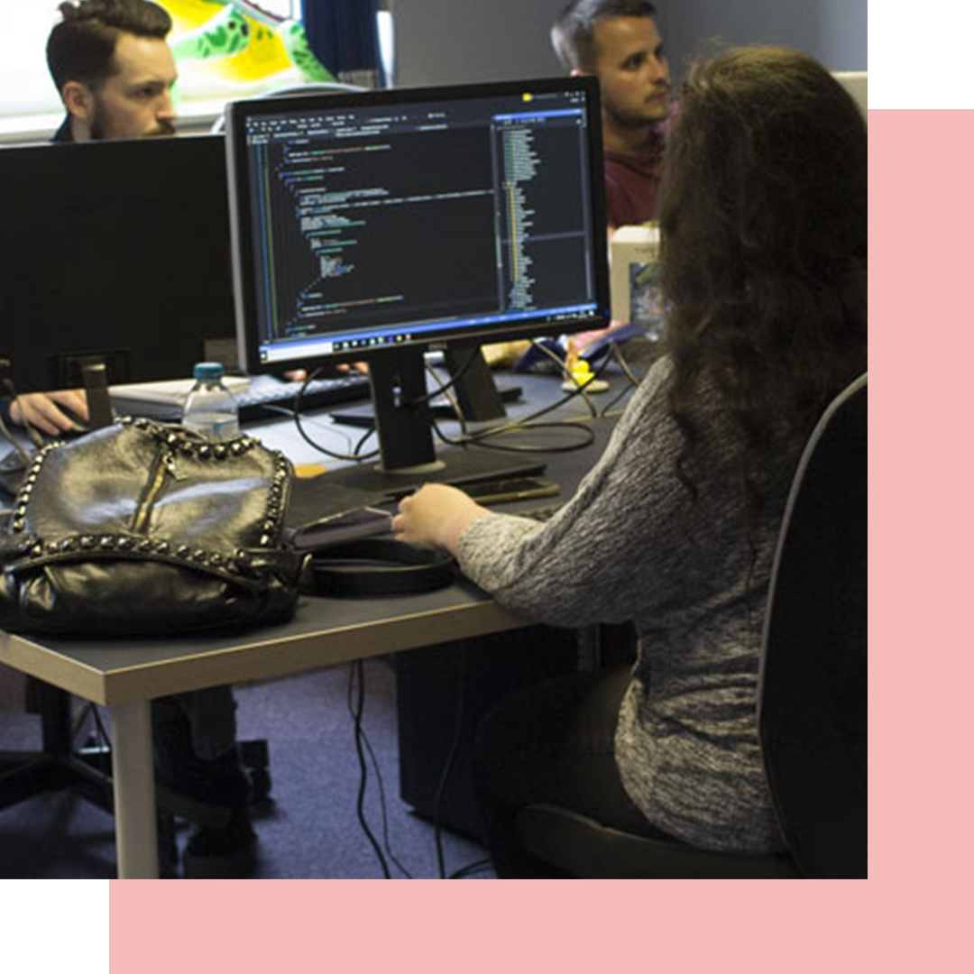
A small agency with a personal touch
Before I joined Bad Dinosaur was an agency of just two developers. The website had been quickly put together by them in little time.
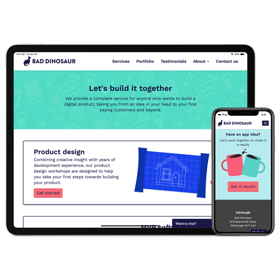
The old website was full of stock photography and icons. We wanted to make it more "Bad Dinosaur". Bad Dinosaur is a small agency with a personal touch and we wanted the website to convey that.
Since Bad Dinosaur work with a lot of people without a background in tech we needed the branding to focus more on product and process than on technology.

Colours
The old branding used a lot of colour, often using it to differenciate different services or products. As part of the rebranding we'd decied to use imagery instead of colour for this so I created a limit pallete that would make our brand quickly recognisable.
The two main colours were a dark navy and a turquoise. The two colours work well together and weren't so playful they couldn't be used in important documents or on office walls.
A secondary pallete was produced to ensure any illustrations looked on brand without being limited by just a few colours.
Logo
As part of the new branding we needed a new logo. The old one no longer fitted with our playful new style. The logo was a good opportunity to hint at the dinosaur in the name without screaming "DINOSAUR".
We went through a few iterations of the logo. We had some claws that looked like giraffes and a few very happy and not-very-bad looking Dinosaurs. We decided on one that looked serious but still playful. As it was a small space we couldn’t get too detailed or realistic so we went for a simple silhouette of a vaguely diplodocus looking Dinosaur.
Creating the logo was an iterative process and I produced over fifty different, small iterations. Nothing was ever deleted and inspiration came from all the previous versions.
Imagery
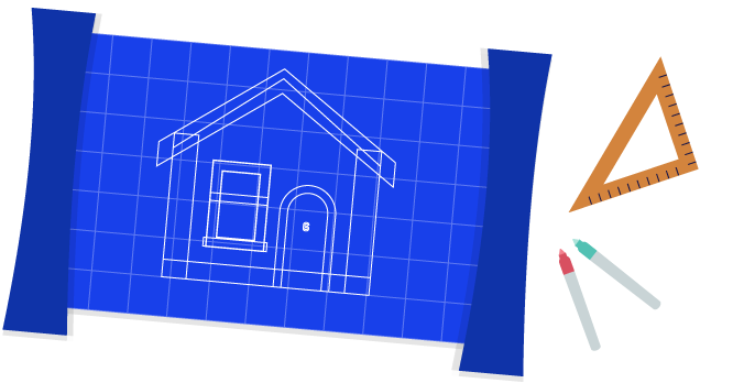
Illustration was a great way to get our processes and ideas across without going into any technical detail. I chose a style that was flat and made of simple shapes. A style that could be taken by other designers in the team and replicated.
Throughout our website we also made sure to use photos of the team, reassuring visitors that we were a small, close-knit team and not a huge studio full of faceless developers and designers.
Roll-out
We rolled the branding out to the website first. We did this under a strict time-demand so chose to spend more time on the homepage and services page. The remaining pages got changed to be inline with the new branding but had no change of structure.
I created illustrations for all our services and replaced any small icons with our own small, less detailed illustrations. I also rolled out the new colour scheme and replaced any stock photography with our own.
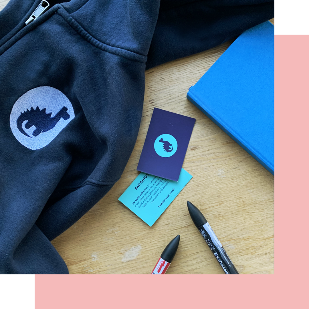
As well as jazzing up our online presence we decided to get some merch produced so we got t-shirts, hoodies and business cards created.